Thursday, 18 September 2014

Size matters

Singapore welcomes the iPhone 6 and 6Plus today with the usual long queues at the sales outlets. The difference this year however is bigger than ever. Literally.

It is intriguing how fast technology and consumers' perceptions change.

Not long ago in 2010/ 11, I was excited to get the Dell Streak 5, one of the biggest smartphones then. The 5” WVGA display was ground breaking. At 152.9 x 79.1 x 10 mm, it was “humongous” for the standard back then. I remember running into curious strangers in the lift and train, who started conversation with me because of the device. It was fun. I also remember a colleague in the office, a proud American Apple user, laughed at it and jokingly asked if it was a calculator.

Fast forward to 2014, smartphones with 5” display is the norm today, albeit with much smaller overall size. Phablets are seen everywhere, over 5”, 6”, and even bigger. Now even Apple who takes pride in setting market standards is following this route, contradicts the legendary founder Steve Jobs’ words. Well, just like many other things he said that eventually slap his face. The iPhone 6Plus is in fact, bigger than other devices with the similar display size. With a dimension of 158.1 x 77.8 x 7.1 mm, the 6Plus is even longer than the “calculator” Dell Streak.

Arguably, the length of the device matters more than the width, and thickness, if the variances are just +/- a few mm. You will know what I mean when sitting down with the phone in your jeans. Let’s look at the more recent popular devices with similar display size:
iPhone 6PlusGalaxy Note 3LG G3
Display5.5”5.7”5.5”
Length158.1 mm151.2146.3 mm

It is clear that iPhone 6Plus is much longer, but with the same or smaller display.

Another interesting thing I noticed when talking to the excited Apple fans - Most of them have the perception that 6Plus is smaller than these similar devices. Some only thought about the display size, for example ‘6Plus 5.5" is smaller than the 5.7” Note’.

It is good to have choices. Maybe iPhone 7Plus will have a stylus. Maybe iPhone will finally ditch its old fashioned physical home button, so they can remove those thick bezels. Why not?

Pebble - Winning Customer Satisfaction

2 weeks ago I was not a happy Pebble user. The smartwatch that I got so used to was broke - the display went haywire.

I was disappointed as the watch was still fairly new. Although it was still under warranty, I wasn't sure my problem would be resolved satisfactorily, as there is no local service center at where I am. I emailed the Pebble customer support, described my issue, got a response within 3 days. The person at the other end showed empathy, asked for supporting proof in the form of photos. And another email exchange, I was promised a replacement set.

Just like that.

Slightly over a week after that, I am now a happy Pebble user again, with a whole new Pebble Steel on my wrist. I am impressed with the service, and I think it gives overseas buyers confidence to its products.

With new waves of smartwatches introduced by the big boys, the future is unknown and challenging to Pebble. The next 12 months will be critical for the company to come out with a sustainable plan. Whatever it is, I hope this inspiring startup survives.

Helpful customer service and satisfied users will only do them good.


Sunday, 14 September 2014

Vivo XShot - The Camera Centric Smartphone Review

Most people do not relate China products with "innovative" or "premium". If you can look past that stereotyping however, there are actually a number of budding tech companies in China that worth looking up. More notably Xiaomi and the OnePlus have certainly made a big splash on the international scene this year. Less so, there are some names you may not heard of but in my view are doing a great job, e.g. Vivo, Oppo, Meizu and  etc.

Vivo for instance, has been coming out with devices that have the most or the first - the slimmest phone, the first 2k phone, and what this review is about, the first phone with both Optical Image Stabilization (OIS) and F/1.8 lens - the Vivo XShot.


Hardware and Design

Vivo XShot comes with two variances, a higher speced Ultimate, and a cheaper Elite version. The Ultimate version sports with the popular Qualcomm Snapdragon 801 processor at 2.5GHz, 3G RAM, 32 GB ROM, micro SD expansion slot (up to 128GB), 5.2 inches 1080P screen, and an impressive high-end audio chipset. The Elite version compromise slightly on a slower Qualcomm Snapdragon 801 processor at 2.3GHz, 2GB RAM, and 16 GB ROM. It is no slouch in terms of hardware, and is on par with the current flagships.

See the full specification here.

The highlights of this phone however are really its cameras. The Vivo XShot comes with  a F/1.8 + OIS 13 megapixel back camera (Sony 2nd gen IMX214) with dual tone flashlight, AND a 8 megapixel 84 degrees wide-angle front camera with LED flashlight. More on them in a while.

The phone itself is a well made device. XShot felt substantial in the hand, due to its steel made chassis that also surround the phone. The steel body is clamshelled by polycarbonate plates and a gorilla glass. Underneath the glass, the 5.2" LG produced 1080p IPS display dominates the front, leaving very little bezels at the side. Delightfully, the display does a good job in complementing the viewing experience for the camera centric phone. The screen is bright (and dim enough when needed), and has good color accuracy. Not that you should be bothered, fyi you will notice a warmer tone when looking diagonally across from the bottom right to the top left of the display. This is commonly found on LG G2 which uses the same panel. It does not affect normal viewing. Even at wide deviated angles, the IPS screen provides good visibility.

Aside of the usual sensors on the front, you will be surprised by a led flashlight! Trust me, you will absolutely love this 8 MP front camera and its accompanied flashlight if you are a selfie person. At the bottom of the screen, there are three capacitive buttons (menu/ home/ back), which sadly do not light up. Though in actual use, I do not find it hard to locate the buttons in the dark.

At the sides, there are four physical buttons all on the right, the volume buttons, the power button which is positioned nicely for your thump, and a welcomed dual-stage camera button nearer to the bottom. On the left, there is a slot with an unique single tray design for both the SIM and SD cards.


The non-removeable back of XShot has a slight curve that helps with the grip. You will not miss the protruding camera. The prominent lens probably fits its image as a camera centric phone. That said, you do worry about the lack of protection on the lens. Also on the back is a long speaker at the bottom which produces respectable sound both in terms of loudness and quality.

The device is powered by a 2600 mAh battery. It is not big for an over 5" phone, but in actual use it proves to be pretty reliable. It can easily last for a day, with over 4 hours screen on time, i.e. active usage.


Software

The XShot comes with Vivo's Funtouch OS which is built on Jellybean 4.3. Currently at version 1.16.2 beta, the Funtouch OS is still very young, and require some polishing, particularly on attention to details. However, it is by no mean immature. The Chinese are very good in 'learning' from the best. You will find several familiar features such as gesture control, one-handed control, double tap to wake and etc. Being a chinese phone, the local version does not come with Google services by default. Instead, the missing Playstore is made up by the Vivo App Store. Not to worry though, the process of setting up Google services is fortunately pretty straightforward. However the de-chinese process is far from complete. Although you can set the language to english, you are almost certained to run into chinese at some corners. Other bugs include for instance unknown location of your contacts (only chinese cities are recognized), and mismatching caller ID due to country prefix.

The Funtouch is a heavily customized OS from the vanilla Jellybean. E.g. the light color tone, iPhone esque slide up control center, just to name a few. The launcher does away with the app drawer, which means all applications are laid out on the main screens, together with the widgets. You can also apply different themes, which are downloadable from the theme store, to the launcher, icons, lockscreen and etc.

Laucher One-handed mode Various gesture control
Apple esque slide up control panel Themes


Camera

If you only want to know one thing about this device, it will be its cameras. Yes the cameras - both the main and the front cameras.


The main camera on the back is a 13 MP Sony camera module that features an F/1.8 lens, with optical image stabilization (OIS). The big deal is that it should produce better images in low light situations. Firstly the F/1.8 lens means the XShot has a much larger aperture than the market norms  F/2.0 -F/2.2 (the smaller F/ number means the bigger aperture) , which also means the lens allow more lights to go in. Secondly the OIS helps to steady the shot when the aperture is left opened for longer time, or when in motion. Most of the manufacturers only go with one of the two, or compensate it with digital stabilization. Vivo XShot is the first mobile phone that has such combination. Also worth mentioning is that larger aperture allows faster shutter speeds, and produce images with shallower depths of field. So you can achieve better close up effect where the focus is on the foreground object, and the background goes blur. There is even a dual-tone flashlight for more natural color balance when it is required. To top it off, there is also a two-stage shutter button that gives you a more camera like experience. At half pressed, the camera will lock the focus, and at full pressed photo will be taken. Double pressing the shutter, even when the screen is off, will activate quick shots where 5 consecutive photos will be taken.

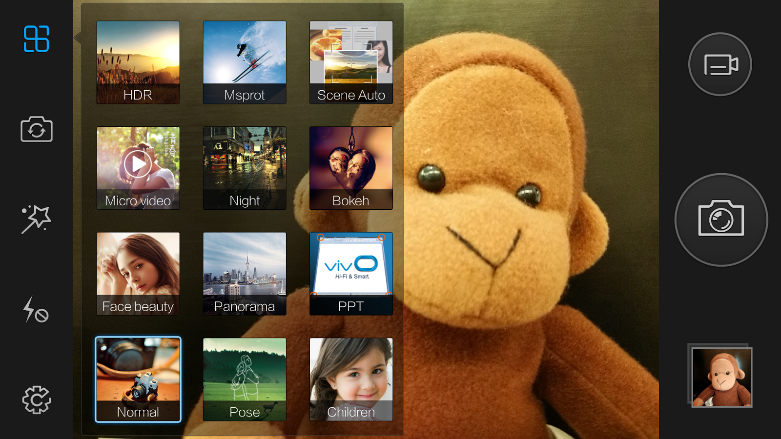
The software side of the camera is packed with various tricks as well. There are a number of predefined scene modes, including the usual Panorama, HDR, Night, Sports and etc. The one unique feature which will surely appreciated by parents is the Children mode - you can trigger sounds (train, bell, kitten etc) that will attract children attention, and the camera will capture a shot when it detects a curious looking face. Another worth highlighting feature is the independent focus and exposure. This allows the camera to detect a better lighting reference from the main object.


But that's not all, there is also a hidden Pro mode, which can be activated with a left swipe to the capture button. In the Pro mode, which you may find the UI familiar, you have a suite of manual control from focus, white balance, shutter speed (up to 32s!), ISO, and EV. There is not much for video recording unfortunately. Yes it shoot 4k, but that's really it. There is no option to chose frame rate, no slow motion, or other video effect. [Edit] Turn out there are slow motion, and a fast video recording options. It was missed as the submenu "Funny Video" simply was not self explanatory.


Normally there is not much to talk about on front camera, but not for the case of XShot. Its selfie shooter is an impressive 8 MP camera with 84 degrees wide angle. Now here is another unusual one, the front camera is aided with a LED flash. You can now take a selfie during a night out. To make taking selfie even more fun, there is Face Beauty mode which will help to boast your confidence by beautifying your skin, giving you bigger eyes, slimmer face, and even give you virtual make up!

Beauty Face mode Selfie with front facing flashlight
in a total dark room

Photos Samples

Here are some photos comparison between the Vivo XShot and Galaxy S4. I wished I could get a newer and better opponent for it, but S4 is the best device I have in my hand, and I trust it as a worthy reference.

Galaxy S4 on the LEFT, Vivo XShot on the RIGHT.


Under good lighting conditions, XShot produces good images with a lot of details. The color reproduction is pretty accurate. You can also produce punchier colors in Auto Scene mode, where saturation tends to be higher. It is not without faults however. In the 4th set of photos [water drop sculptures, HDR], there is noticeable purple fringing at the ceiling window grills. The control on glaring light sources (e.g. street lamp, direct sun light) also require further improvement.

Where XShots really stands out, is when under low light situations. The last three sets of photos were taken with Night mode on both phones. XShots' images are without doubt brighter, have less noises, while retaining more details.

More XShot photos


Conclusion

The Vivo Xshot is one capable device. It has the flagship hardware. It has good cameras that provide fun photography experience. And it looks decently nice.

However at RMB 2,999 (US$ 407) for the Elite version, and RMB 3,499 (US$ 570) for the Ultimate version, the Vivo Xshot is not exactly cheap. Particularly from a lesser known chinese brand. Also, the phone is currently only available in China, Malaysia, and Thailand. Yes, you can still get it online, but you may not get the necessary support both in terms of geographic, and language barrier.

All in all, I will recommend the device to people that enjoy mobile photography, who appreciate manual control, and don't mind the potential lack of support. As it is to me, a keeper.


Sunday, 27 July 2014

Still spending but no time to write

It has been 2 months since my last post! Lines of new toys have since been released since then - LG G3, OnePlus One, Mi Pad, Mi 4, etc etc... Just show how quickly technology products are released.

Wish I have all the time and money to play with them. But I'm not gonna find excuse cos of my laziness.
Shall be back soon!

Friday, 30 May 2014

Samsung Galaxy S4 – One Year Later

No, this is not about a new gadget. Technologies move so fast that most gadgets have rather short product cycle. By the first month of a product launch (sometime even before the launch), the craze would be over, and everyone moved on to the next shiny new toy.

This is my take of the one-year old Samsung Galaxy S4.

S4 with Sugru corner bumper

I have not used a Samsung phone prior to the S4. For some reason, I am not a Samsung fan – I don’t associate Samsung as cool, and they are definitely not value for money judging from their recent price list. While my view hasn't changed after using the S4, I get to understand why people buy it. In fact, it has just become my longest serving smartphone.

The evolution and lack of


Not long ago before the S4, the Galaxy lines were still in the shade of iPhone. It started off as little knockoff, there is no two ways about it. But that i-mould has certainly faded away since the S3 came about. More importantly, should you care? Unless you are an iFan or Apple shareholder, there is really no reason to be upset about competitors stealing the good and useful features from one another. In fact, the competition is only good for us as the consumers. Although you could, you don’t reinvent the wheels to build a car. That’s how technology evolves at a faster speed.

The pebble shaped S3 is the big leap of the Galaxy lines in terms of design language. It found its own style with little shadow from the iPhone-ish S2. I would actually rate S3 as the best design among S1 – S5. Perhaps because of the success, Samsung became overly cautious in the subsequent releases in S4 and even S5. There was no significant change to the design, other than it getting bigger and more angular. The continuation of material choice also left little to be desired of. S3 was a breakthrough, S4 was sleek, and S5 was just pure boring and arguably a step back. Responses from the recent launch events were evident of that disappointment. Hopefully the departure of the Galaxy’s Chief Designer represented a new chapter of the Samsung flagship.


Why is it a keeper?

Although it does not stand out in its look, S4 is a well-built device. The thin bezels still look as sleek next to the freshly baked S5. I am happy to report that my S4 withstood a full year of daily use, and aged gracefully. Admittedly, I am very careful with all my gadgets. The plastic made body is not as flimsy as it sounded. There is no loose, or deformed parts because of normal wear and tear. Buttons remain responsive, and the battery continues to serve me for about a day.

Samsung produce hardware components, and keep the best and the latest for themselves. A prime example is its AMOLED screen, which is arguably the killer feature of Samsung phones. The AMOLED screen is known for its vibrant and saturated colors, with deep black, and great power efficiency. Some people may find the popping colors unnatural, but they are undeniably beautiful screens. I actually know a few friends who are reluctant to switch just because of the screen.

Another popular feature is its expandability. S4, like the other Galaxy devices, has a removable back. When unveiled, you can find options to add more storage (sd card), more battery life (extended battery), better NFC detection, wireless charging extension, or simply change the look of the phone. It is this “option” that many of us really appreciate. In many ways “option” is also the essence of Android.

with wireless charging receiver

There is almost no major flaw (less the design yes) with the S4. It has one of the best camera, great battery life, descent speakers and what not. The phone is still running smooth and strong after one year, during which different versions of Jellybean and KitKat have been rolled out.

Using a mass popular phone model also means that there is vast range of accessories available. Ask a Nokia user and you will know the pain of being special. There is also more resources and support e.g. in the form of forums like XDA.

I find it strange that there is no urge for me to change the phone. Considering I am not exactly a Samsung fan, and I used to upgrade every 6 months in average. Perhaps it is the overall usability of S4, or perhaps it is the maturity of the smartphone industry. The latest range of smartphones no longer beat the last generation by miles.

Samsung, and in fact all manufacturers, needs a breakthrough. Something that is truly special AND useful. Or risk becoming the next Nokia and Blackberry.

For now I am still enjoying the old S4...... wait, is that a LG G3?!

Wednesday, 2 April 2014

Flip Back the Time - TWEMCO Clock

Unlike their smaller counterpart on the wrist, wall clocks do not normally get much attention. Although they serve the same purpose to tell time, the technology and craftsmanship of watches are valued more than the bigger and often more boring wall clocks. That said, clocks can be an important fixture, or even a fashion statement.

I love flip clocks in particular. The movement when the flaps flip fascinates me. One of the reasons why I got the HTC phone years ago, was because of their trademark flip clock widget.

There are not many flip clock manufactures around the globe. One of them, the Hong Kong based TWEMCO, has been building just that for more than 50 years.

TWEMCO clocks have an unmistakable minimalist retro design. Because of the mechanism, TWEMCO clocks are quite thick, but weigh lighter than its look suggest, due to the plastic body. The contrasting white text on the black flaps makes it easy for telling time. TWEMCO clocks are tuned with Germany  movement, which has high precision and is battery friendly. Some of the models even come with date and day of the week.

I have a 6 year old TWEMCO clock which is still flipping strong. Just recently, my wife suggested we get a conventional clock for the little ones at home, so they can learn to read time. Fair enough I thought. But in the end I can't resist another TWEMCO; albeit this one comes with the conventional clock hands, it still has the flipping calendar!


Thursday, 20 March 2014

Potential Yardstick of Smartwatches - Moto 360

An iconic product design is hard to come by. More recently in the 21st century, you may have witnessed the likes of Motorola Razr V3, iPod 2, HTC Diamond, IntelliMouse Explorer, iPhone 3, B&O A8, Macbook Air and etc. Some of these were so important it broke away as THE yardstick that defined a product line, and made it widely adopted.

Fast forward to 2014, a new product line that the IT industry is pushing very hard to make it happen is the wearable tech. Looking at the current poster boys e.g. the Glass, and Pebble, it is not hard to tell that it has not taken off yet. While Pebble does come close, and in fact is very usable, it is lacking the whoa factor.

Introducing Moto 360.


One of the two devices which represented the introduction of Android Wear, Moto 360 comes with an exciting form factor - it is circular. The significance of it is that it looks like a normal watch, and a cool one. Apparently more than 80% of the watch faces are round in shape. Motorola is hoping that its fashion come first product will break the mass public resistance to wearable tech. 

There are still a lot of unknown, like the battery life, screen resolution, and most importantly the software Android Wear. The visual of the Wear in the introduction video seemed very likable. The UI also appeared to be rather fluid from the Endgadget interview, when Moto 360 designer Jim Wicks showed off a working prototype.


Will Moto 360 finally become that yardstick of smartwatches? Let's find out later in the summer.